Perceptual Bias
Perceptual and cognitive psychology (Helmholtz; Gestalt school; Richard Gregory; Simons & Chabris)

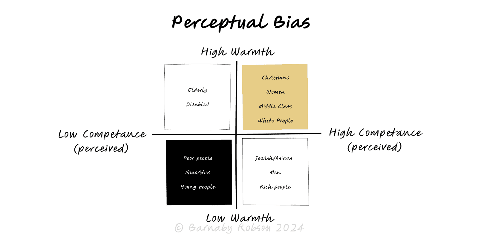
Perceptual bias refers to predictable errors in how stimuli are noticed and interpreted. The brain uses shortcuts—attention filters, expectations, and context rules—to build a fast, useful picture of the world, but these can mislead. Classic demonstrations include inattentional blindness (missing the obvious while focused), change blindness (failing to see large changes), and contrast/context effects that alter size, colour or risk judgements.
Selective attention – limited bandwidth forces focus on a task; salient but task-irrelevant signals are missed (e.g., the “invisible gorilla”).
Inattentional & change blindness – we miss unexpected items and even big alterations across cuts or interruptions.
Top-down expectations – prior knowledge fills gaps; we perceive what we expect to be there.
Context & contrast effects – surroundings shift judgements of size, colour, loudness, value (e.g., identical greys look different on varied backgrounds).
Adaptation & fatigue – prolonged stimulation changes sensitivity (after-effects).
Priming & salience – recent cues and standout features direct attention and influence interpretation.
Channel limits – colour vision, peripheral acuity, and time resolution impose hard constraints.
UX & product – layout, colour, motion and copy affect noticeability and error rates.
Data visualisation – scales, baselines and encodings can mislead; preattentive features guide reading.
Safety & operations – alarms, dashboards and checklists designed to avoid misses under load.
Research & testing – observer bias and demand characteristics; need for blinding and standard protocols.
Negotiation & comms – order, emphasis and presentation shift perceived strength of the same facts.
Forensics & QA – eyewitness reliability; duplicate inspection to reduce misses.
Design for attention limits – one clear focal action per screen; remove non-essential motion; use whitespace.
Use robust encodings – position/length over colour/area; include zero baselines where appropriate; label directly.
Standardise context – consistent scales, legends, and units; avoid misleading aspect ratios.
Add redundancy – colour + shape + text for critical states; don’t rely on colour alone.
Sequence information – reveal most critical cues first; place warnings before irreversible actions.
Blind & randomise – in research/reviews, hide labels and randomise order to reduce expectation effects.
Apply checklists & double-checks – independent second look for high-stakes judgements.
Train with variation – expose teams to edge cases to reduce over-fitting to familiar patterns.
Test in context – evaluate designs under realistic time pressure, lighting, device and noise conditions.
Instrument misses – log near-misses, misclicks and alarm fatigue; iterate where perception fails.
Pretty but misleading charts – truncated axes, inconsistent scales, or deceptive colour maps.
Overloading – too many signals create blindness; prioritise and batch.
Assuming experts are immune – expertise shifts what’s noticed but doesn’t remove bias.
One-off lab tests – pass in calm conditions, fail in the field; always do in-situ trials.
Over-correcting – excessive alerts cause habituation; tune sensitivity and escalation paths.
